


What is Tailwind CSS?
Tailwind CSS is a framework that provides a collection of low-level utilities that help you build fast and maintainable web pages. It is highly focused on a mobile-first approach. Tailwind’s goal is to make it easier for developers to create beautiful, responsive layouts with as little code as possible.
Installation
In this article we are going to learn two ways to install tailwind in your system:
By using CDN
By using CLI
1. Using the CDN method:
Start by adding the CDN script tag to your HTML file, and start using Tailwind’s utility classes to style your content.
<script src="https://cdn.tailwindcss.com"></script>
2. Using the CLI method:
- Install tailwindcss via npm, and create your tailwind.config.js file.
npm install -D tailwindcss
npx tailwindcss init
- Configure your template paths:
/** @type {import('tailwindcss').Config} */
module.exports = {
  content: ["./src/**/*.{html,js}"],
  theme: {
    extend: {},
  },
  plugins: [],
}
- Add the Tailwind directives to your CSS:
@tailwind base;
@tailwind components;
@tailwind utilities;
- Start the Tailwind CLI build process:
npx tailwindcss -i ./src/input.css -o ./dist/output.css --watch
- Now you can start using Tailwind in your HTML.
Core Concepts
1. Utility-First Fundamentals:
Tailwind provides us with highly compassable utility classes but leaves the design specification completely up to the user to maintain that custom look and feel of your app. Let's look at the example:
<div class="bg-white mx-auto max-w-sm shadow-lg rounded-lg overflow-hidden">
  <div class="sm:flex sm:items-center px-6 py-4">
    <img class="block h-16 sm:h-24 rounded-full mx-auto mb-4 sm:mb-0 sm:mr-4 sm:ml-0" src=" " alt="">
    <div class="text-center sm:text-left sm:flex-grow">
      <div class="mb-4">
        <p class="text-xl leading-tight">Abhijeet</p>
        <p class="text-sm leading-tight text-grey-dark">Web Developer</p>
      </div>
      <div>
        <button class="text-xs font-semibold rounded-full px-4 py-1 leading-normal bg-white border border-purple text-purple hover:bg-purple hover:text-white">Message</button>
      </div>
    </div>
  </div>
</div>
So in the above example, we use many predefined classes to design our page:
- The background color, border radius, and box-shadow utilities (bg-white, rounded-lg, and shadow-lg) to style the card’s appearance.
- The max-width and margin utilities (max-w-sm and mx-auto) to constrain the card width and center it horizontally.
- Tailwind’s flexbox and padding utilities (flex,py-6 and px-6) to control the overall card layout.
- The font size, text color, and font-weight utilities (text-xl, text-grey-dark, font-semibold, etc.) to style the card text.
2. Handling Hover, Focus, and the Other States:
Using utility classes to style elements on hover, focus and more.
1.hover:
 <button class="bg-blue-600 m-4 ml-5 p-4 hover:bg-red-600
 hover:text-white">Click here</button>
In the above example when we hover on a button the color will change from blue to red.
2.focus:
<input class="m-4 ml-5 p-4 border-red-300 focus:border-blue-400" />
In the above example when we focus on the input tag the color will change from red to blue.
3.active:
<button class="m-4 ml-5 p-4 bg-blue-500 active:bg-red-600 ">
  Active
</button>
In the above example when the button is pressed the color will change from blue to red.
There are many more utility classes there to style the elements.
3. Responsive Design:
Responsive design can help you solve a lot of problems for your website. It will make your site mobile-friendly, improve the way it looks on devices with both large and small screens, and increase the amount of time that visitors spend on your site. It can also help you improve your rankings in search engines.
There are five breakpoints by default:
| Breakpoint prefix | Minimum width | CSS |
| sm | 640px | @media (min-width: 640px) { ... } |
| md | 768px | @media (min-width: 768px) { ... } |
| lg | 1024px | @media (min-width: 1024px) { ... } |
| xl | 1280px | @media (min-width: 1280px) { ... } |
| 2xl | 1536px | @media (min-width: 1536px) { ... } |
To add a utility but only have it take effect at a certain breakpoint, all you need to do is prefix the utility with the breakpoint name, followed by the : character
<button class="bg-blue-600 m-4 md:m-6 lg:m-8 ">
Click here</button>
This will change the margin of the button in medium and larger devices.
Typography
1. Font-Family:
Utilities for controlling the font family of an element
| Class | Properties |
| font-sans | font-family: ui-sans-serif, system-ui |
| font-serif | font-family: ui-serif, Georgia, |
| font-mono | font-family: ui-monospace |
- You can control the typeface of text using the font family utilities.
<p class="font-mono ...">The quick brown fox .</p>
- We can change fonts on hover also.
<p class="font-sans hover:font-serif">
 The quick brown fox.
</p>
- We can use the customization method also:
module.exports = {
  theme: {
    fontFamily: {
      'sans': ['ui-sans-serif', 'system-ui', ...],
      'serif': ['ui-serif', 'Georgia', ...],
      'mono': ['ui-monospace', 'SFMono-Regular', ...],
      'display': ['Oswald', ...],
      'body': ['"Open Sans"', ...],
    }
  }
}
2. Text Overflow:
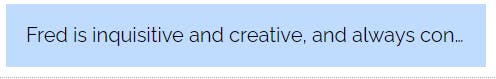
- Use truncate to truncate the overflowing text with an ellipsis (…) if needed.
<p class="truncate">Fred is inquisitive and creative, and always conjuring up ways to improve Binaryville and the lives of its inhabitants.</p>
- Use text-clip to truncate the text at the limit of the content area.
<p class="text-clip overflow-hidden ...">...</p>
Flexbox:
Flexbox is a model used to make a layout on elements in a container. It allows these elements to align and distribute within a given space.
- Flex-direction: There are four flex-direction properties we use:
| Class | Properties |
| flex-row | flex-direction: row; |
| flex-column | flex-direction: column; |
| flex-row-reverse | flex-direction: row-reverse; |
| flex-column-reverse | flex-direction: column-reverse; |
- Flex-Wrap: There are three different flex-wrap properties we use:
| Class | Properties |
| flex-wrap | flex-wrap: wrap; |
| flex-nowrap | flex-wrap: nowrap; |
| flex-wrap-reverse | flex-wrap: wrap-reverse; |
There are many more flex-properties there to make our webpage looks good.
Conculusion:
Hope this reference guide has given you a some brief idea about what Tailwind CSS is.